Leonid Afremov
Leonid Afremov is a Russian-Israeli artist who paints mainly using oils. I think the main purpose of his work is to create incredible paintings that capture people with their use of color and texture. In each of his pieces, the lighting in the painting creates a really beautiful reflection on either the surface of the water or the ground and the bright colors make the pieces very vivid and full of life. Also, the use of lights and darks in each of the paintings help guide your eyes through each piece.
Salvador Dali
Salvador Dali was a surrealist painter who painted using oil paints. His paintings were created to create a skewed and interesting perspective for the viewer. Some of Dali's work is very crisp and clean while other pieces have a lot of texture. He does a great job creating contrast in his pieces to make certain elements pop even his simplest works are still beautiful and interesting.
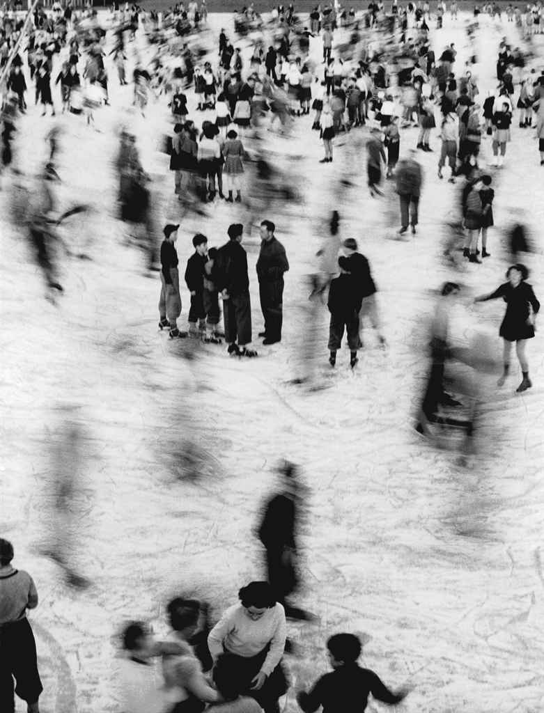
Mario de Biasi
Biasi is an Italian photographer and photo journalist. He uses interesting perspectives in his photos to create captivating images. The lines and reflection in the photo on the left create a very strong and visually interesting photo. It makes it difficult to tell where the buildings actually start and stop. The middle photo is my favorite. I love the few blurred ice skaters surrounding the people in the center of the photo. It draws your eye in even though there is a lot going on. I also love the perspective of the photo on the right. The people are at the very bottom of the photo, but using the sky to take up so much space really causes the viewer to focus on the people even more. Also, the clouds look amazing and I really like the contrast between the bright sky on the right as it fades to darker clouds on the left of the photo.


%20.JPG)
%20.JPG)
%20.JPG)


.JPG)
.JPG)
